Quick Find


Can you ever have enough white in an interior colour scheme? For the purposes of photo shoots, a white or neutral background provides more opportunities for stylists and photographers to stage and create sets to make products centre-stage. If a location allows painting and decorating then white certainly lends itself to ‘less clash’.
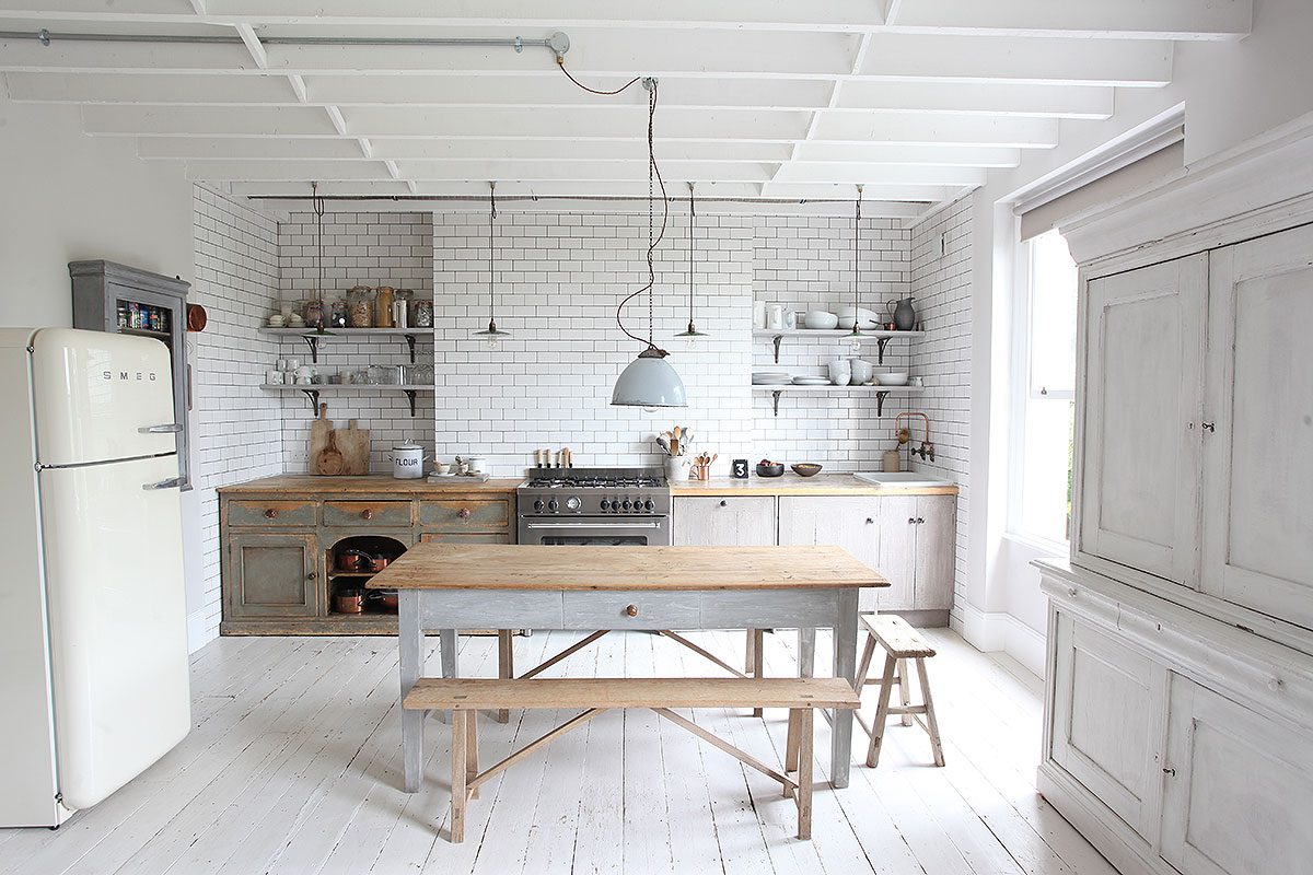
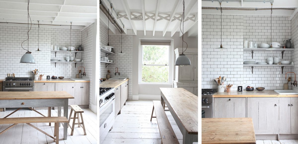
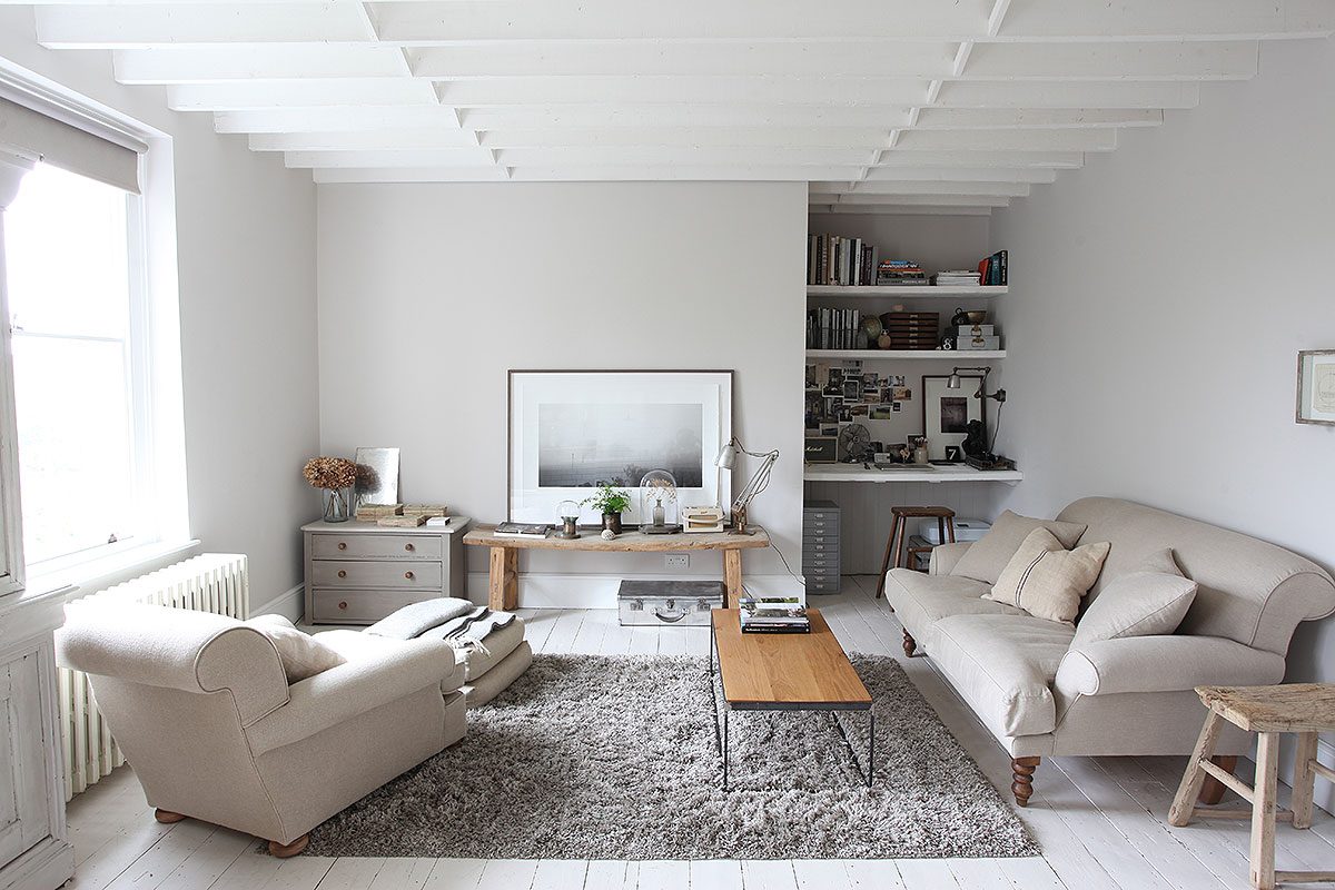
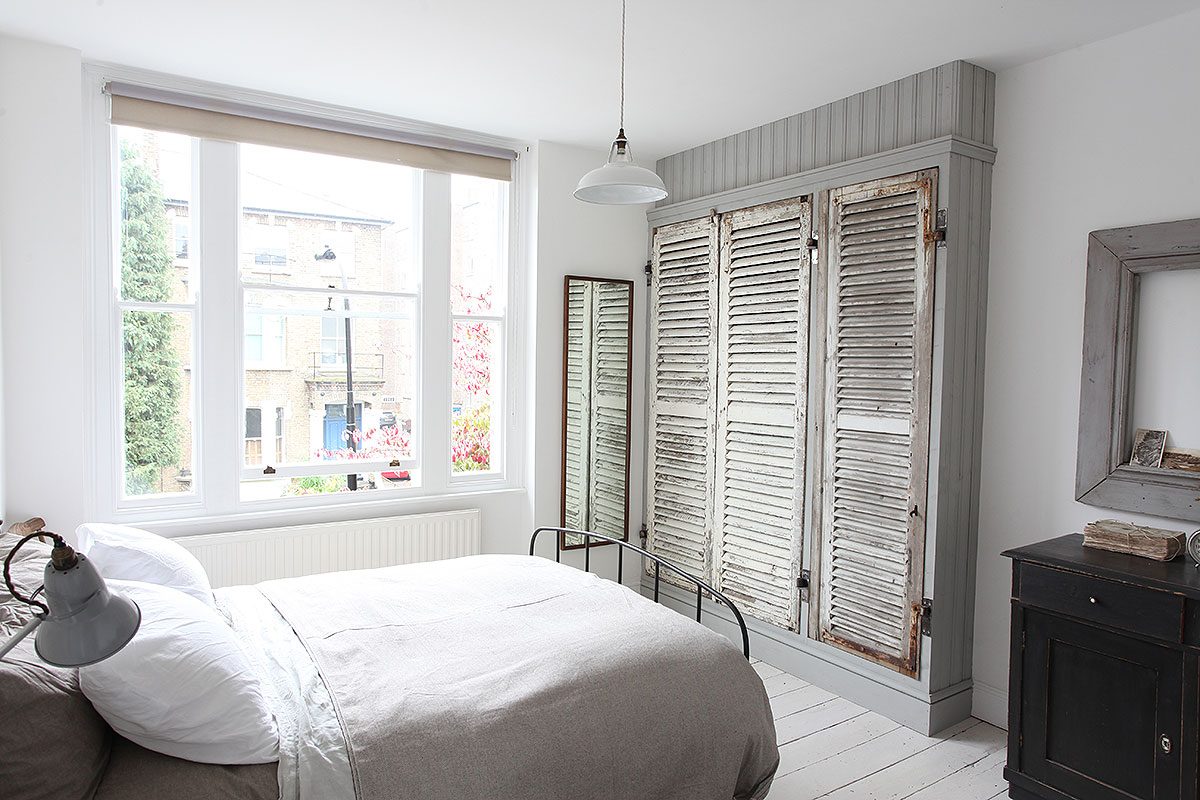
So what about white for everyday living in everyday interiors? Well as our Primrose Flat goes to show – white is dramatic and it isn’t boring, and it keeps a room or home simplistic but strong. White is also surprisingly practical if used wisely. White carpets are never going to stay white but a painted white floor improves with regular wear and tear.
White also allows you to bring focus to key pieces of furniture or quirky lighting, as illustrated at our Primrose Flat. By having a white canvas your treasures receive a new lease of life and old items are drawn into the present.
White also allows textures to come alive that might otherwise be hidden in a busy colour scheme. Wood and white for example go hand in hand as seen in the Primrose Flat kitchen .The glorious wooden worktops and faded painted cupboards bring beautiful warmth to the room.
If you are considering a white colour scheme, a word of advice that comes from years of photographing hundreds of images in white rooms. Don’t be fooled into thinking white is just white. Did you know that there are more than 200 shades of white interior paint! Each comes with different underlying hues that make accompanying colours pop. Experiment a little and make sure you see how the different whites change throughout the day.
For more white inspiration take a browse through our neutral photo shoot locations and be inspired.